

#4: What's going on with bonds?
#4: What's going on with bonds?
Fed tightening in the face of a slower economy has prevented bonds from catching a bid.

Summary:
Yields have risen despite lower commodity prices and slower economic growth
The Fed’s underlying measures of inflation remain elevated, and the labour market remains robust
The Fed is forced to act in a counter-cyclical manner which hasn’t been seen since the late 70’s. This should continue to put pressure on longer dated bonds
Where do you think the 10-year would be if I told you we’d see the following over the next 3 months:
Input price growth rolling over sharply
Supply chain pressure easing
Demand for goods stalling; and
Far lower oil and commodity prices
If you answered ‘yields would go lower’, like me you’d have been wrong.
This was the scenario I outlined in my previous post ‘The perfect storm for bonds is now abating’. Much of it has even come to pass, but it just hasn’t mattered.
The 10-year yield has rocketed to new highs and now sits at c. 3.8%, up from 3.1% when I wrote my initial post. I exited the trade on 1st September at a loss, but luckily some of this was negated due to dollar appreciation.

So, what’s been going on?
Growth continues to slow as tighter financial conditions have impacted Capex, residential investment and durable goods consumption in particular.
Chart 1: Capex and residential investment fell of a cliff in Q2
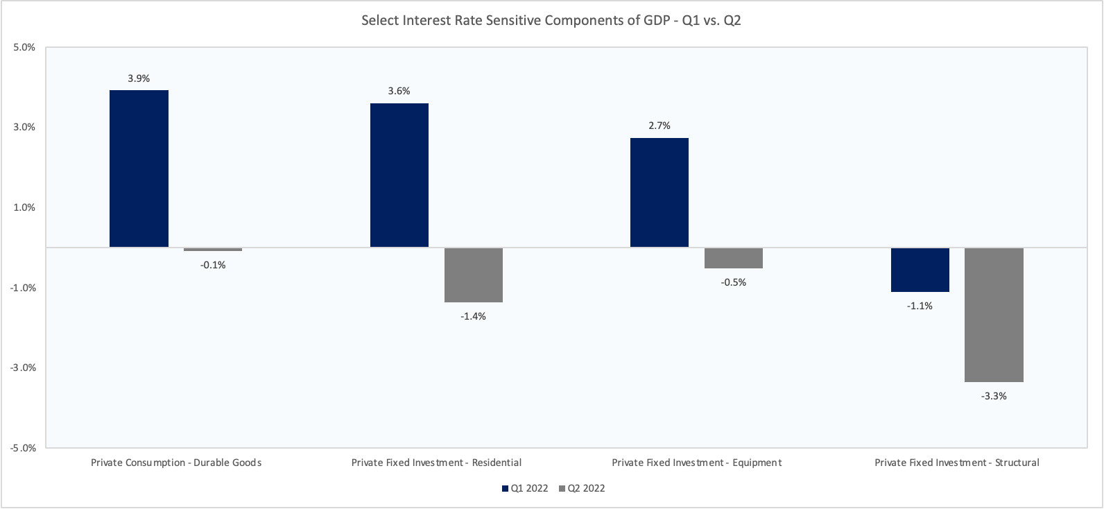
Source: FRED, VKMacro
Much of the supply chain and commodity driven inflation also looks to be easing, best evidenced by July’s negative m/m headline CPI print (August release). Lower gasoline and used car prices particularly helping.
While we know that rent and shelter (which represent c. 40% of CPI) will remain stubbornly high for a while, there has been real progress in other areas. For instance, the 3m/3m change core goods inflation fell to 1.5% in August from over 3% in January.
Chart 2: Core goods inflation continues to decelerate as inventory pressures build

Source: FRED, VKMacro
Where have I been wrong?
This is where things get a bit more interesting.
Despite some areas of slowing, we’re still nowhere near a recession.
Following August’s PCE print, demand for services is now growing at c. 2% on a 3m/3m basis. Services now makes up 62% of total consumption, up from a low of 58% in April 2021, but still has some way to go from the 64% pre-pandemic level.
Chart 3: Services consumption continues to grow strongly in real terms
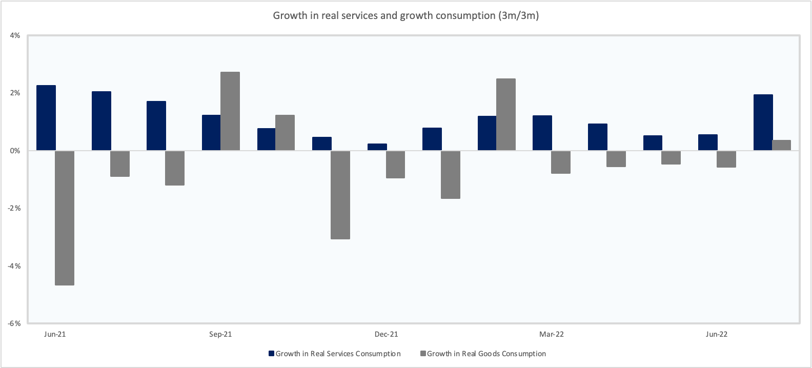
Source: FRED, VKMacro
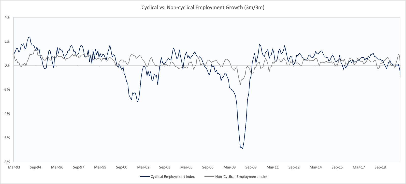
The labour market is another key area of strength with robust jobs growth being seen across the board. While most analysts incorrectly label the labour market as a lagging indicator, I like to dig a bit deeper. Splitting employment growth within cyclical and non-cyclical industries provides a much clearer read into the economy.
Chart 4: Employment within cyclical industries typically slows 6-12 months prior to a recession
Source: FRED, VKMacro
Typically, employment within cyclical industries rises as the economy is strong, and begins to slow far in advance of a recession. However, employment as a whole appears lagging due to the impact of non-cyclical industries where job growth is less volatile and not as dependent on economic conditions.
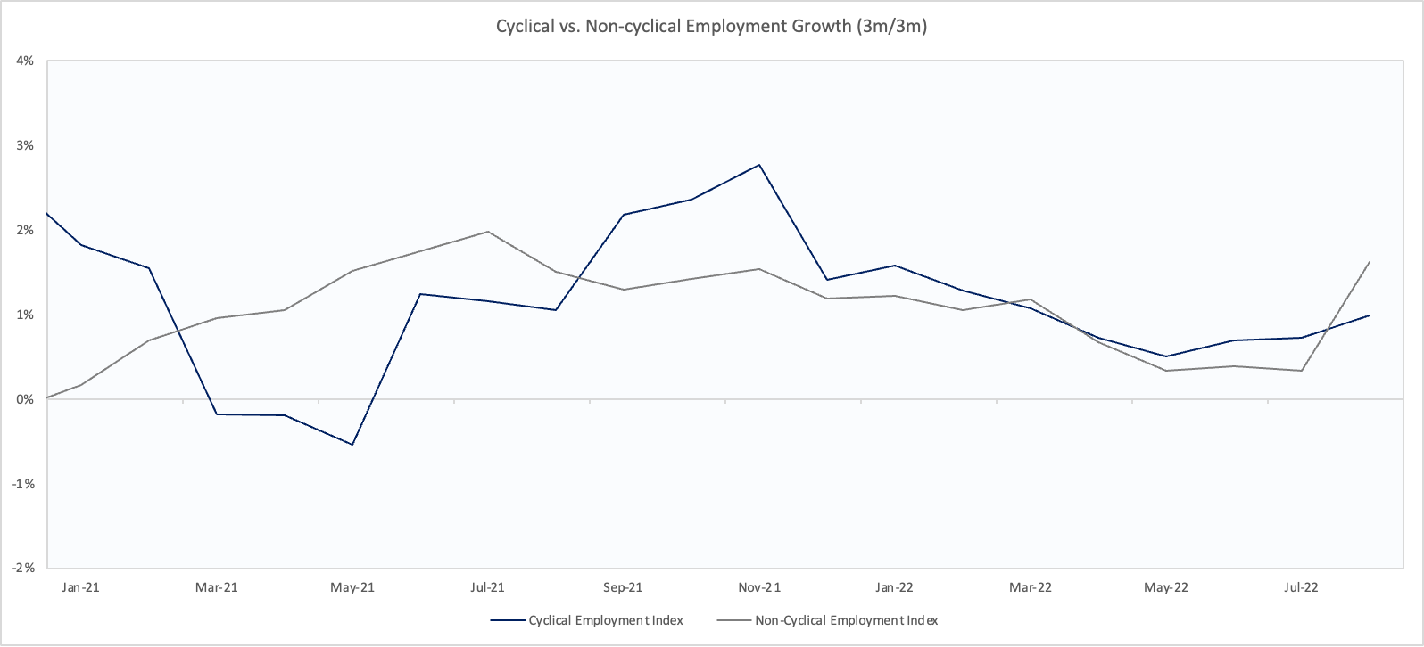
Today, we can see that employment growth within both cyclical and non-cyclical industries has been accelerating over recent months. This is not something you’d expect to see prior to a Fed pivot!
Chart 5: Employment growth in both cyclical and non-cyclical industries has accelerated in recent months
Source: FRED, VKMacro
There are a few points of consideration from this:
Companies within cyclical industries are unlikely to increase hiring unless they have some certainty about demand over the next 6 months or so
The difficulty companies have faced in finding employees until now may mean that job cuts seen during the recession may be slower to occur and less in magnitude relative to previous cycles
The current employment picture does nothing to ease the Fed’s worries about inflation now
The third area (driven by the two above) is that despite signs of inflation cooling in a more cyclical sense, the Fed’s own measures of underlying inflation haven’t turned yet.
There’s a number of ways to look at this such as the sticky price CPI, trimmed mean PCE, and many more. Pick your poison.
Chart 6: The Fed’s own measures of underlying inflation continue to hit multi-decade highs despite lower commodity prices
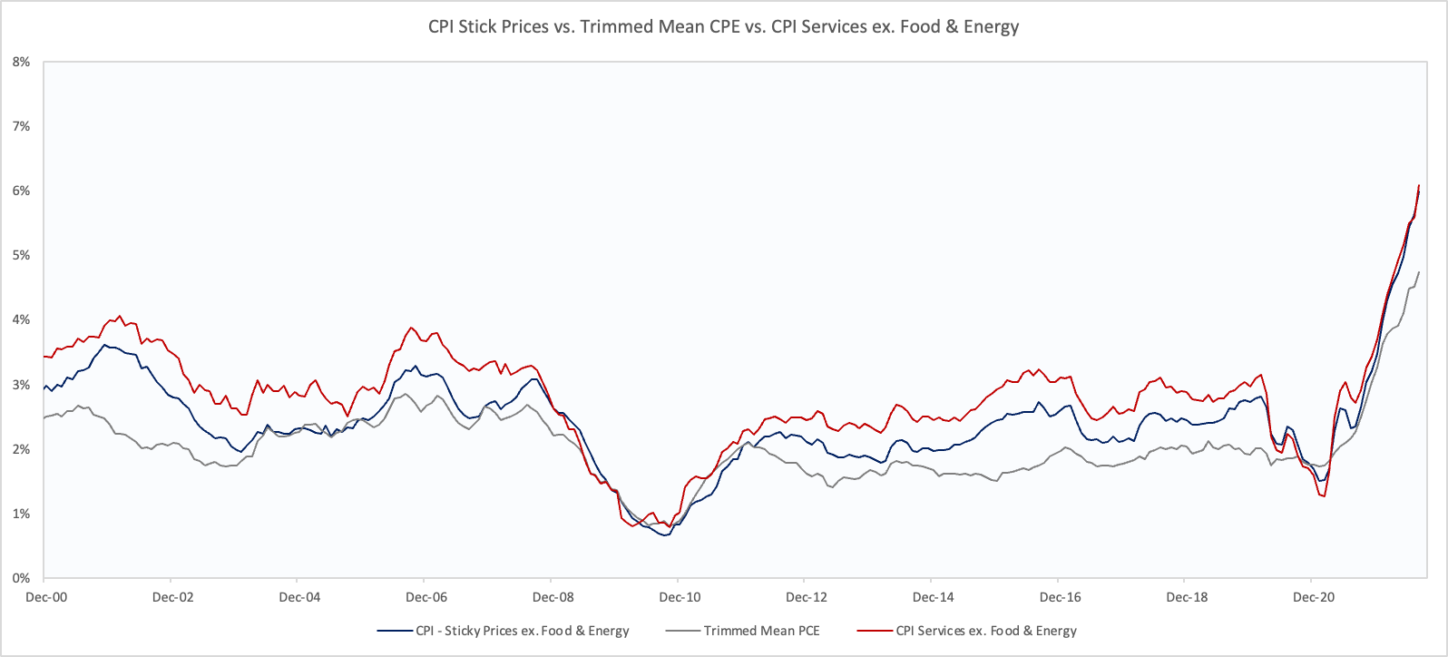
Source: FRED, VKMacro
Underlying inflation remaining stubbornly high is important, as the Fed has provided countless indications that there will be no pivot, regardless of economic weakness until there are clear signs of getting back to the Fed’s 2% target. The most notable being Powell’s speech at Jackson Hole – my highlights can be found below:
Today, my remarks will be shorter, my focus narrower, and my message more direct.
Restoring price stability will take some time and requires using our tools forcefully to bring demand and supply into better balance. Reducing inflation is likely to require a sustained period of below-trend growth. Moreover, there will very likely be some softening of labor market conditions. While higher interest rates, slower growth, and softer labor market conditions will bring down inflation, they will also bring some pain to households and businesses. These are the unfortunate costs of reducing inflation. But a failure to restore price stability would mean far greater pain.
The U.S. economy is clearly slowing from the historically high growth rates of 2021, which reflected the reopening of the economy following the pandemic recession.
The labor market is particularly strong, but it is clearly out of balance, with demand for workers substantially exceeding the supply of available workers.
Restoring price stability will likely require maintaining a restrictive policy stance for some time. The historical record cautions strongly against prematurely loosening policy.
Our monetary policy deliberations and decisions build on what we have learned about inflation dynamics both from the high and volatile inflation of the 1970s and 1980s, and from the low and stable inflation of the past quarter-century. In particular, we are drawing on three important lessons.
History shows that the employment costs of bringing down inflation are likely to increase with delay, as high inflation becomes more entrenched in wage and price setting.
These lessons are guiding us as we use our tools to bring inflation down. We are taking forceful and rapid steps to moderate demand so that it comes into better alignment with supply, and to keep inflation expectations anchored. We will keep at it until we are confident the job is done.
If you think about the Fed’s toolkit with regards to rates, there are essentially 3 levers which can be pulled. The speed of rate increases, the level of rates, and the duration. The consequence of the greater than expected core inflation print for August was for markets to increase their expectations of all 3, i.e. the market is now pricing that the Fed will get even tighter, sooner, and for much longer.
For instance, the expectation in June was that the Fed would stop hiking with the FF rate at 3.5% to 4% and cut over 2023. Now, this is far higher with expectations edging towards 4.5% - 4.75% with virtually no cuts priced in next year.
Chart 7: The market has ratcheted up their expectations of the terminal rate. Now sits at c. 4.5% from 3.5% in June.
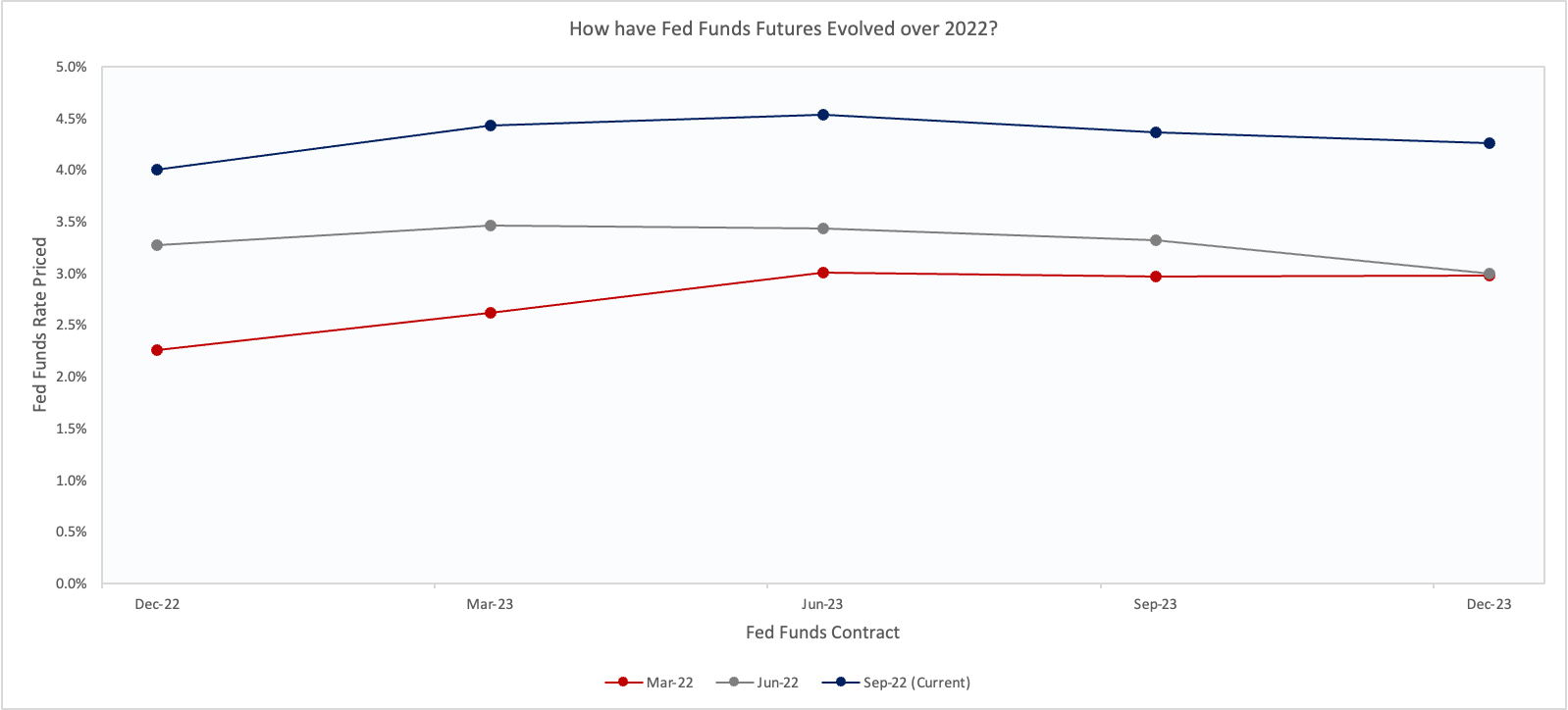
Source: CME, VKMacro
The September inflation report (for August) was really the ‘ah-ha’ moment for me as it solidified the environment that we’re now in.
The environment we’re now in is one where monetary policy is forced to move in a counter-cyclical manner to the economy.
Typically, the Fed would raise rates with inflation in a strengthening economy, and then would lower them as the economy showed signs of slowing. This has particularly been the case in recent history where the Fed has been able to act sooner as inflation has never really exceed their 2% mandate.
Whereas now, the Fed is telling us that they will continue to raise rates despite signs of a weaker US economy, and a significantly weaker global economy.
Not only this, they are also committed to leaving rates elevated to ensure that there’s no repeat of an Arthur Burns-esque error where the Fed lowered rates too early allowing for inflation to become embedded by the time Paul Volker took charge.
Chart 8: 10-Year yields rose over 74-75 and 80-82 on a year on year basis even as the economy entered a recession
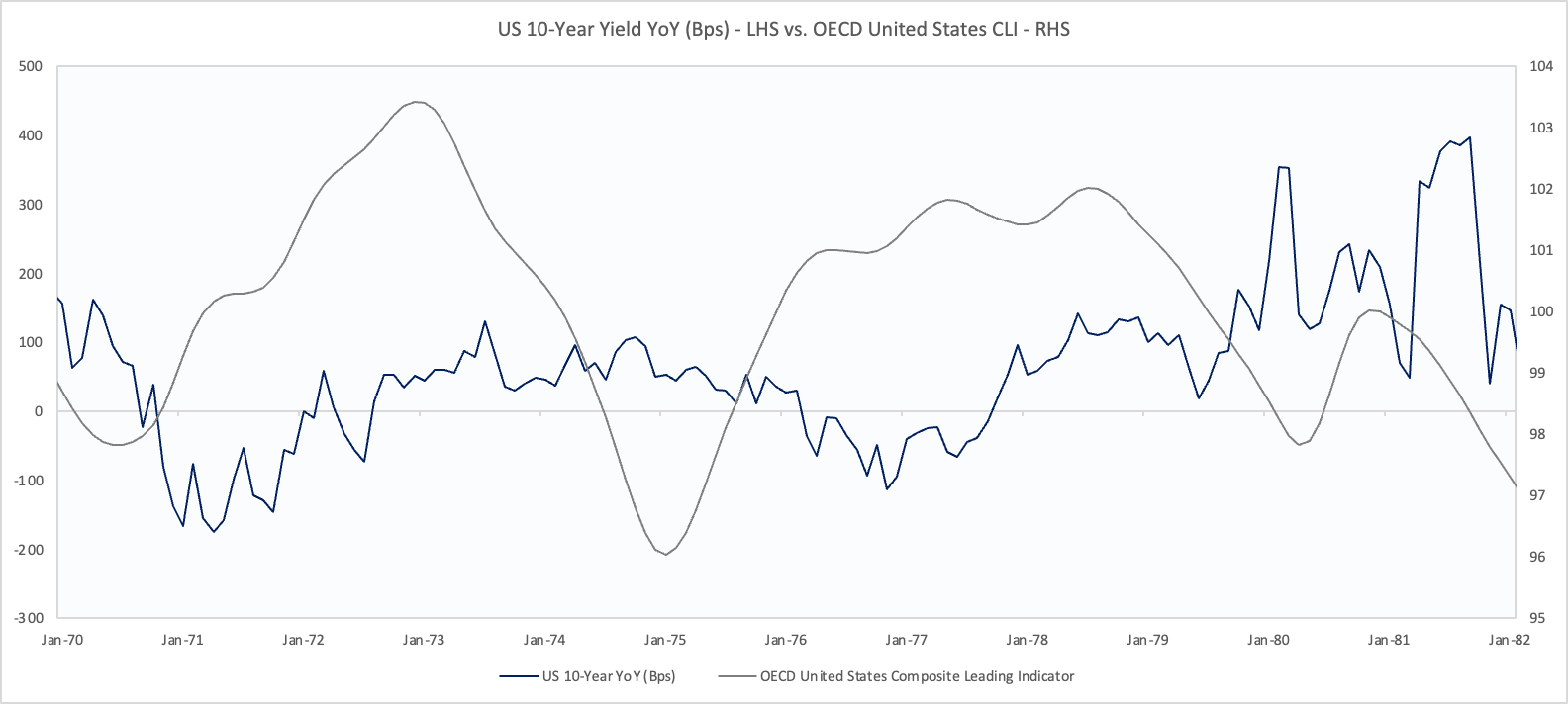
Source: FRED, VKMacro
Therefore, regardless of your view of whether this is a 1970’s style inflation problem, the Fed has committed to a 1970’s monetary policy framework.
The combination of rising rates amid a slowing economy is a toxic one for risky assets. It’s particularly difficult for equites to remain high when you’re not only having to cut estimates of future cash flows, as well as increasing the discount rate being applied.
This is one of the main reasons why we’re now seeing a positive relationship between stocks and bonds and also why various macro models (such as some of mine) which were built on the post 80’s disinflationary world have stopped working.
Chart 9: The correlation between stocks and bonds has turned firmly positive
Rolling 100 day correlation between S&P 500 ($SPX) and the Aggregate Treasury Index ($AGG):
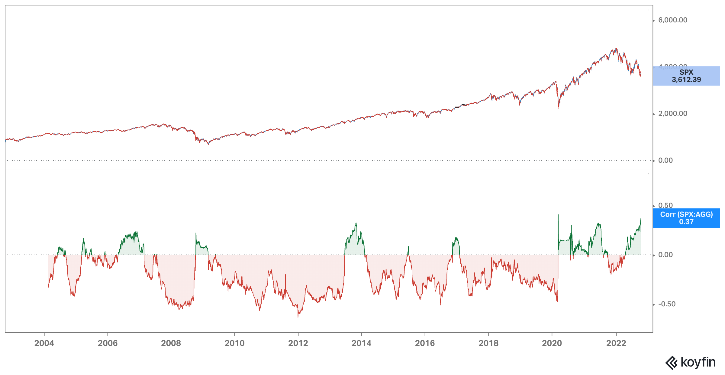
Source: Koyfin
So, bringing this back to the longer end, we’ve seen that as expectations of future Fed hikes, the long-end of the treasury curve has also risen too.
Yes, the curve can become more and more inverted, in fact that’s exactly what we saw in the late 1970’s where the 2s10s curve inverted by more than 200 bps.
The US 2s10s treasury curve is currently inverted by c. 40 bps. This is already in the left tail of the historic distribution.
Chart 10: The US 2s10s curve is currently inverted by c. 40 bps

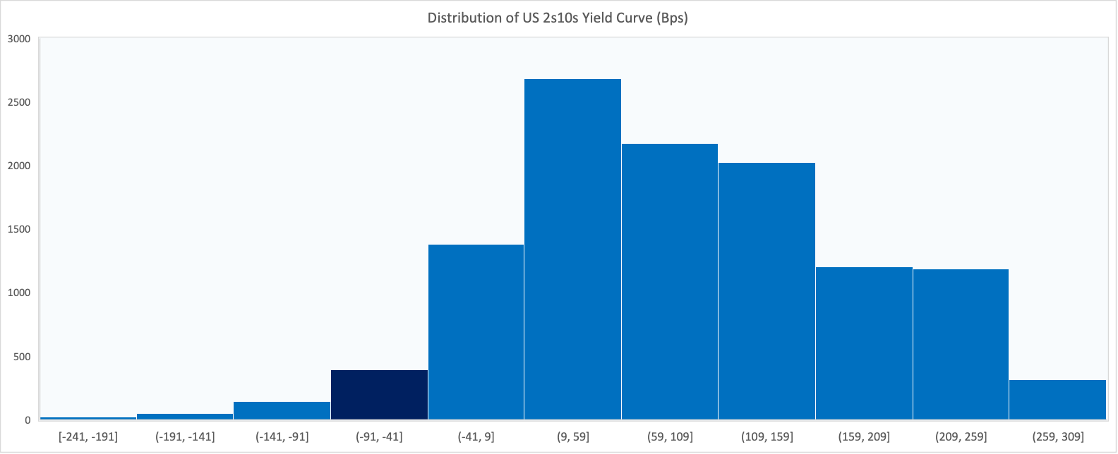
Source: FRED, VKMacro
The chart above shows that the largest inversions of the curve were between 100 and 200 bps, occurred during the late 1970’s during the ‘Volker shock’ but this was with rates being significantly higher.
So, what’s next?
Typically, what we’ve seen is that the long end continues to rise until the Fed has completed its hiking cycle. This is one of the more important mistakes I made in my previous analysis, which is not respecting the strength of the US economy and underestimating the level rates could get to in order for the Fed to reach their goal.
Chart 11: The 10-Year yield struggles to fall until the Fed is done hiking rates
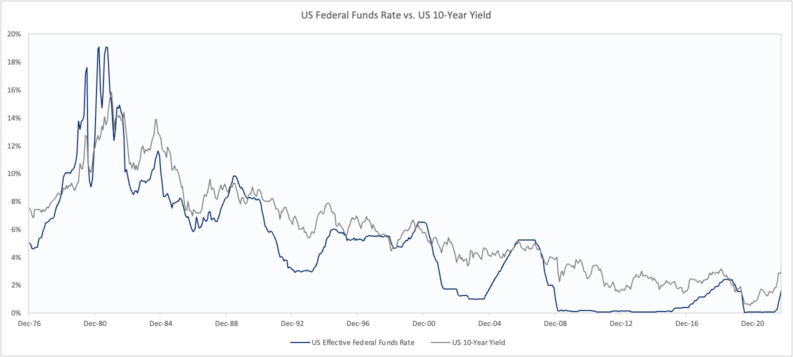
Source: FRED, VKMacro
The Fed has also stated their desire to ensure real rates are positive across the curve which is almost the case currently bar the spot rate (FFR).
Chart 12: Real rates are now positive for 5 and 10-Year Treasuries

Source: FRED, VKMacro
My sense is that downside is pretty limited for yields while the Fed continues to hike to reach their desired target. Considering what’s happened so far, we also shouldn’t rule out the terminal rate rising once more - this is actually very likely! Therefore, I tend to lean short rates for the next 3 - 6 months rather than long.
We can also build a probabilistic framework based on the shape of the curve using our expectations of shorter term rates. Based on a terminal rate of above 5%, we can forecast a 10-year between 4.4% and 4.1% which still leaves some upside (downside in prices).
We also shouldn’t forget that the job gets more difficult from here on out. As the growth picture continues to deteriorate, if we begin to see cracks in the labour markets, the market could begin pricing cuts once more to test the Fed. This is what makes the risk/reward difficult.
So I think the ugly grind continues and the market remains difficult to trade. We should watch for over-extensions in either direction to begin putting on trades and longer term investors should continue to remain defensive and overweight cash.
Summary:
Yields have risen despite lower commodity prices and slower economic growth
The Fed’s underlying measures of inflation remain elevated, and the labour market remains strong
The Fed is forced to act in a counter-cyclical manner which hasn’t been seen since the late 70’s which should continue to put pressure on longer dated bonds
Thanks,
VKMacro
Great analysis! Liked your points about cyclical and non cyclical employment. What data do you use for the cyclical employment?